


Overview
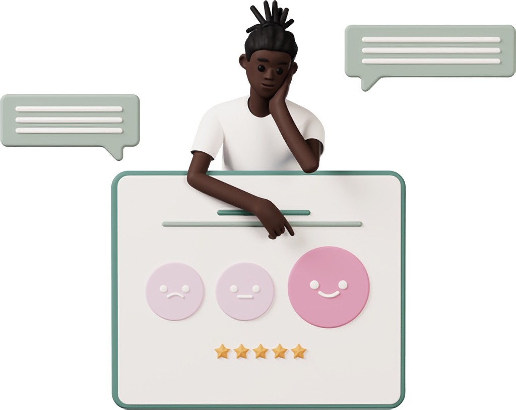
Why are we abandoning users at the 90% mark?
Parkr AI is an app to help people find parking in the city. The project aims to reduce stress when it comes to driving, increase safety, and allow people to plan ahead. Additionally, increased confidence in city-parking helps draw more people to local events, allowing for city growth and diversity.
Overview
Why are we abandoning users at the 90% mark?
Parkr AI is an app to help people find parking in the city. The project aims to reduce stress when it comes to driving, increase safety, and allow people to plan ahead. Additionally, increased confidence in city-parking helps draw more people to local events, allowing for city growth and diversity.
PLATFORM
iOS
PLATFORM
iOS
ROLE
Designer and Vibe-Coder
ROLE
Designer and Vibe-Coder
TOOLS
Figma • Cursor • Xcode
TOOLS
Figma • Cursor • Xcode
DURATION
2022 – Present
DURATION
2022 – Present
Problem Statement
Finding city parking is tough due to sign complexity and variations
Like many cities, Rochester, New York has a lot to do. At the same time, it has a lot of different rules when it comes to parking. For those who are not familiar with the city, it can become overwhelming to park.
Problem Statement
Finding city parking is tough due to sign complexity and variations
Like many cities, Rochester, New York has a lot to do. At the same time, it has a lot of different rules when it comes to parking. For those who are not familiar with the city, it can become overwhelming to park.
Problem Statement
Finding city parking is tough due to sign complexity and variations
Like many cities, Rochester, New York has a lot to do. At the same time, it has a lot of different rules when it comes to parking. For those who are not familiar with the city, it can become overwhelming to park.

Population (2022)
209,352
Population (2022)
209,352
Population (2022)
209,352
Types of Parking Signs
70+
Types of Parking Signs
70+
Types of Parking Signs
70+
Festivals / Year
140
Festivals / Year
140
Festivals / Year
140
Park here!
Park here!
Park here!
Only on Weekdays.
Only on Weekdays.
Only on Weekdays.
And after 6 pm.
And after 6 pm.
And after 6 pm.
Red cars only.
It's hard to juggle all of this while you're driving. In fact, it can become distracting as people focus on reading signs, they forget to focus on the road. Others end up receiving tickets, induced stress, or see the city as inaccessible.
Red cars only.
It's hard to juggle all of this while you're driving. In fact, it can become distracting as people focus on reading signs, they forget to focus on the road. Others end up receiving tickets, induced stress, or see the city as inaccessible.
Red cars only.
It's hard to juggle all of this while you're driving. In fact, it can become distracting as people focus on reading signs, they forget to focus on the road. Others end up receiving tickets, induced stress, or see the city as inaccessible.


Solution
Parkr AI
A user-friendly mobile and desktop app designed to help users easily find parking, avoid tickets, and navigate signage before they arrive at their destination.
Solution
Parkr AI
A user-friendly mobile and desktop app designed to help users easily find parking, avoid tickets, and navigate signage before they arrive at their destination.
Solution
Parkr AI
A user-friendly mobile and desktop app designed to help users easily find parking, avoid tickets, and navigate signage before they arrive at their destination.
Parking Finder
Users can input a destination and find available parking options.
Parking Finder
Users can input a destination and find available parking options.
Parking Finder
Users can input a destination and find available parking options.
Pre-Pay & Rule Review
Pre-pay for parking spots and review parking rules before arrival.
Pre-Pay & Rule Review
Pre-pay for parking spots and review parking rules before arrival.
Pre-Pay & Rule Review
Pre-pay for parking spots and review parking rules before arrival.
Customizable Filters
Users can input a destination and find available parking options.
Customizable Filters
Users can input a destination and find available parking options.
Customizable Filters
Users can input a destination and find available parking options.
Design Process
What are people struggling with?
Understanding the pain points of users is crucial when designing a solution that effectively addresses their issues and solves their problems. Conducting surveys, interviews, and benchmarking against competitors are excellent ways to identify user challenges and gauge their expectations.
Surveying
User Interviews
Benchmarking
Surveying
• 70% of respondents reported difficulty reading parking signs while driving, leading to ticket anxiety.
• Accessibility was a recurring issue, with a notable percentage of respondents mentioning difficulty in finding nearby spots, particularly those with disabilities.
• Many expressed frustration over a lack of real-time parking availability information, especially during large events.
Surveying
User Interviews
Benchmarking
Surveying
• 70% of respondents reported difficulty reading parking signs while driving, leading to ticket anxiety.
• Accessibility was a recurring issue, with a notable percentage of respondents mentioning difficulty in finding nearby spots, particularly those with disabilities.
• Many expressed frustration over a lack of real-time parking availability information, especially during large events.
1
2
3
Surveying
• 70% of respondents reported difficulty reading parking signs while driving, leading to ticket anxiety.
• Accessibility was a recurring issue, with a notable percentage of respondents mentioning difficulty in finding nearby spots, particularly those with disabilities.
• Many expressed frustration over a lack of real-time parking availability information, especially during large events.
Say "Hi" to Personas
Say "Hi" to Personas
Say "Hi" to Personas
Mona
Teacher • 32 yrs old

Background
Mona is a long-time Rochester resident and consultant who regularly drives downtown to meet clients. Despite having lived in the area her entire life, she still finds it difficult to navigate parking rules and often ends up with tickets due to tight schedules and unclear signage.
Goals
Mona’s goals are to find parking quickly, avoid tickets, and ensure she can attend client meetings on time. She also hopes to deepen her knowledge of the city’s parking options to reduce future challenges.
Frustrations
Mona is often frustrated by sparse or poorly designed parking signage and the difficulty of identifying legal parking spots near fire hydrants, driveways, or restricted zones. Her busy schedule leaves her little time to research parking options in advance, adding to her stress.
Mona
Teacher • 32 yrs old
Background
Mona is a long-time Rochester resident and consultant who regularly drives downtown to meet clients. Despite having lived in the area her entire life, she still finds it difficult to navigate parking rules and often ends up with tickets due to tight schedules and unclear signage.
Goals
Mona’s goals are to find parking quickly, avoid tickets, and ensure she can attend client meetings on time. She also hopes to deepen her knowledge of the city’s parking options to reduce future challenges.
Frustrations
Mona is often frustrated by sparse or poorly designed parking signage and the difficulty of identifying legal parking spots near fire hydrants, driveways, or restricted zones. Her busy schedule leaves her little time to research parking options in advance, adding to her stress.
Cameron
Student • 24 yrs old

Background
Cameron is an occasional visitor to Rochester who recently faced parking challenges while attending a birthday dinner at a rooftop restaurant. Navigating an unfamiliar area caused him significant anxiety, especially when he discovered a parking ticket on his windshield later that evening due to unclear parking signage.
Goals
Cameron’s primary goals are to find parking easily, avoid parking tickets, and reduce the stress associated with figuring out where to park. He values a straightforward solution that allows him to plan parking in advance and focus on enjoying his time out.
Frustrations
Cameron finds parking signs difficult to read, especially while driving, and struggles with constantly changing parking rules. He is frustrated by the need to spend extra time and effort planning parking when attending events in unfamiliar areas.
Cameron
Student • 24 yrs old
Background
Cameron is an occasional visitor to Rochester who recently faced parking challenges while attending a birthday dinner at a rooftop restaurant. Navigating an unfamiliar area caused him significant anxiety, especially when he discovered a parking ticket on his windshield later that evening due to unclear parking signage.
Goals
Cameron’s primary goals are to find parking easily, avoid parking tickets, and reduce the stress associated with figuring out where to park. He values a straightforward solution that allows him to plan parking in advance and focus on enjoying his time out.
Frustrations
Cameron finds parking signs difficult to read, especially while driving, and struggles with constantly changing parking rules. He is frustrated by the need to spend extra time and effort planning parking when attending events in unfamiliar areas.
Alberto
Accountant • 62 yrs old

Background
Alberto is a new resident in Rochester who is still unfamiliar with the city’s layout and parking rules. He often looks for parking spots in advance but sometimes avoids going out altogether due to the challenges of finding accessible and convenient parking.
Goals
Alberto’s main goals are to find parking spots effortlessly and use an app that is intuitive, distraction-free, and accessible for someone with low vision. He wants parking to feel simple and stress-free, allowing him to focus on enjoying his new city.
Frustrations
Alberto struggles with reading unclear parking signs and finds most parking apps overly complicated and clunky. He is easily deterred by confusing information or overly complex systems, which limits his ability to explore the city.
Alberto
Accountant • 62 yrs old
Background
Alberto is a new resident in Rochester who is still unfamiliar with the city’s layout and parking rules. He often looks for parking spots in advance but sometimes avoids going out altogether due to the challenges of finding accessible and convenient parking.
Goals
Alberto’s main goals are to find parking spots effortlessly and use an app that is intuitive, distraction-free, and accessible for someone with low vision. He wants parking to feel simple and stress-free, allowing him to focus on enjoying his new city.
Frustrations
Alberto struggles with reading unclear parking signs and finds most parking apps overly complicated and clunky. He is easily deterred by confusing information or overly complex systems, which limits his ability to explore the city.
Thinking like a user
To build a seamless experience for Parkr users, I mapped out both the user flow (how users move through the app) and the user journey (the steps they take, including their emotional experience at each point). These tools allowed me to design with empathy, ensuring that users of various backgrounds and needs would find the app intuitive and stress-free.
Need for advanced parking
Users like Elia and Mona highlighted the need for timed parking search and scheduling for future events.
Need for advanced parking
Users like Elia and Mona highlighted the need for timed parking search and scheduling for future events.
Need for advanced parking
Users like Elia and Mona highlighted the need for timed parking search and scheduling for future events.
Simplified Navigation for Reduced Cognitive Load
Users like Alberto, unfamiliar with the city or with accessibility needs, preferred simple screens with auto-populated search and large buttons, which reduced frustration and boosted confidence.
Simplified Navigation for Reduced Cognitive Load
Users like Alberto, unfamiliar with the city or with accessibility needs, preferred simple screens with auto-populated search and large buttons, which reduced frustration and boosted confidence.
Simplified Navigation for Reduced Cognitive Load
Users like Alberto, unfamiliar with the city or with accessibility needs, preferred simple screens with auto-populated search and large buttons, which reduced frustration and boosted confidence.
Parking Spot Customization
Users highly valued customization features like avoiding parallel parking and filtering by price. Tailoring parking preferences made the app more flexible and user-friendly, especially for those with specific needs.
Parking Spot Customization
Users highly valued customization features like avoiding parallel parking and filtering by price. Tailoring parking preferences made the app more flexible and user-friendly, especially for those with specific needs.
Parking Spot Customization
Users highly valued customization features like avoiding parallel parking and filtering by price. Tailoring parking preferences made the app more flexible and user-friendly, especially for those with specific needs.
Information Architecture and Workflows
Map it out
Before getting into the designs, creating an information architecture helps me account for all the different pages and workflows. This way, I get a high-level view of the app's hierarchy, helping me understand the depth of the app.
Information Architecture and Workflows
Map it out
Before getting into the designs, creating an information architecture helps me account for all the different pages and workflows. This way, I get a high-level view of the app's hierarchy, helping me understand the depth of the app.
Information Architecture and Workflows
Map it out
Before getting into the designs, creating an information architecture helps me account for all the different pages and workflows. This way, I get a high-level view of the app's hierarchy, helping me understand the depth of the app.
Sign Up Workflow
Open the App
Open the App
Enter Email
Enter Email
Enter Name
Enter Name
Enter Password
Enter Password
Sign Up
Sign Up
Sign In Workflow
Open the App
Open the App
Enter Email
Enter Email
Enter Password
Enter Password
Sign In
Sign In
Alert Preferences Workflow
Open the App
Open the App
Go to Account Settings
Go to Account Settings
Notification Settings
Notification Settings
Choose Alert Preferences
Choose Alert Preferences
Parking Workflow
Open the App
Open the App
Type in Directions
Type in Directions
Find Available Spots
Find Available Spots
Get Parking Information
Get Parking Information
Route to Parking
Route to Parking
Explore Workflow
Open the App
Open the App
Swipe Down
Swipe Down
Explore Spots
Explore Spots
Sign Up Workflow
Open the App
Enter Email
Enter Name
Enter Password
Sign Up
Sign In Workflow
Open the App
Enter Email
Enter Password
Sign In
Alert Preferences Workflow
Open the App
Go to Account Settings
Notification Settings
Choose Alert Preferences
Parking Workflow
Open the App
Type in Directions
Find Available Spots
Get Parking Information
Route to Parking
Explore Workflow
Open the App
Swipe Down
Explore Spots
Then sketch it out
After having a fundamental map of the app's hierarchy and information architecture, I can begin making some preliminary sketches. Since I have all the information I would need for different pages, it's a matter of practicing common UX practices to determine the size, placement, and arrangements of UI elements.


Switch to Hi-Fi designs
Before testing with the users, I created some mockups for users to interact with. I used high-fidelity mockups since Apple's Figma Community files allows for easy mocking up. With better mockups, users can understand the functionality of the application better, resulting in better feedback.


People wanted a quicker way to select times.
During user testing, I gathered a few friends to test out the functionality of the app. I curated questions that helped them understand the application, but made sure not to guide them towards an answer or a solution. Instead, timing their task for completion and listening to their thoughts is what helps most.

"I'd like to be able to select times easier"
"I got overwhelmed with a whole calendar and time thing coming up"

"So, do I have to type in the time every time I want to see parking spots?"
iteration
Iterate. Iterate. Iterate.
Understanding user feedback is crucial in iterating designs. Out of the research participants, a majority of users suggested that they do not want to select specific dates and times.
iteration
Iterate. Iterate. Iterate.
Understanding user feedback is crucial in iterating designs. Out of the research participants, a majority of users suggested that they do not want to select specific dates and times.
iteration
Iterate. Iterate. Iterate.
Understanding user feedback is crucial in iterating designs. Out of the research participants, a majority of users suggested that they do not want to select specific dates and times.
7 out of 10
People requested a quicker way to select their date and time.

50% of people
Half of the people wanted to be able to park on a street even if the parking didn't allow it.
Reason being, sometimes the signs or regulations are not up-to-date due to local events.
Developer Handoff
What do developers get?
When I design, developers get an organized .zip file that outlines the overview of the project, workflows, page and component details, and all assets for the application. Each element and workflow is defined with notes to help add context to the application.
Providing support
Providing support to developers is key in making sure my project is executed as intended. A lot can be lost between handoff and some information that seems straightforward, may not be for someone new to your project. Answering questions and addressing behaviors on a weekly basis helps the product be developed as intended.
Results and Impact
So, was the problem actually solved?
The Parkr AI app significantly improved user satisfaction by reducing parking-related stress and enabling most users to find a spot in under five minutes. Key features like customizable parking options were well-received, with 75% of users appreciating the tailored experience. The app also encouraged 60% of users to attend more city events, enhancing community engagement and accessibility.
Under 5 Minutes
Most users found and reserved parking in under 5 minutes after testing.
Under 5 Minutes
Most users found and reserved parking in under 5 minutes after testing.
Under 5 Minutes
Most users found and reserved parking in under 5 minutes after testing.
80% More Confident
Users felt more confident navigating city parking due to features like signage previews and parallel parking avoidance.
80% More Confident
Users felt more confident navigating city parking due to features like signage previews and parallel parking avoidance.
80% More Confident
Users felt more confident navigating city parking due to features like signage previews and parallel parking avoidance.
75% User Satisfaction
Users appreciated the app’s filtering options, feeling it was tailored to their needs.
75% User Satisfaction
Users appreciated the app’s filtering options, feeling it was tailored to their needs.
75% User Satisfaction
Users appreciated the app’s filtering options, feeling it was tailored to their needs.
60% Increase
Users reported they would attend more city events thanks to the app’s convenience
60% Increase
Users reported they would attend more city events thanks to the app’s convenience
60% Increase
Users reported they would attend more city events thanks to the app’s convenience

